Challenge
The organization had a lot of opportunity to drive donations but suffered from a lack of cohesive messaging and intuitive user flows. With a low conversion rate across their existing media, it was clear something was broken.
Idea
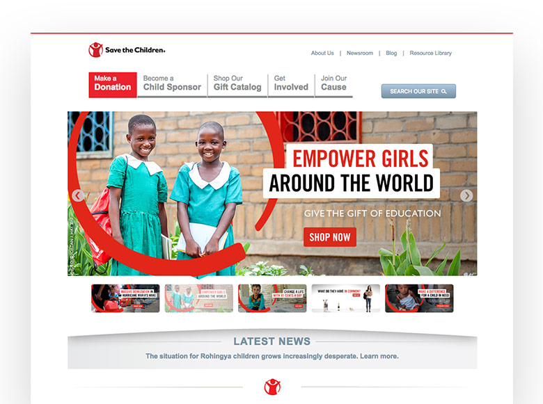
We set out to overhaul their existing framework with a three-part plan: target the right audience, simplify the messaging, and streamline user flows across Save the Children's site.
Simplifying the Message
In a competitive market, we needed a creative campaign that elevated us above the noise. "Make Change" was a simple statement that deftly and succinctly communicated how coins in our pocket make a vital difference in children's lives – thereby turning the brand's mission into tangible action.
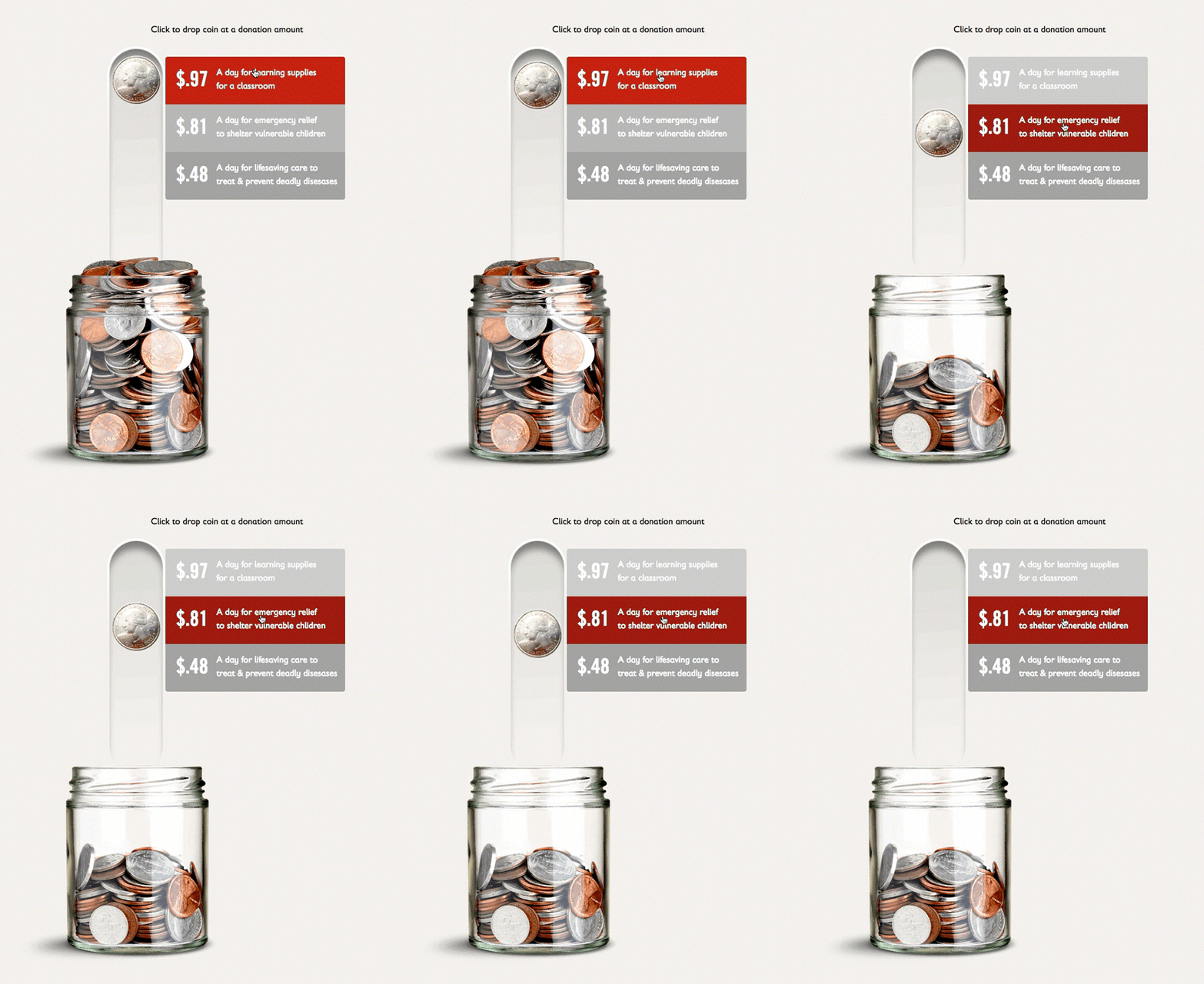
A digital campaign made it more real by calling out specifics, like the amount it takes to provide food to hungry children, (it’s 87 cents, by the way). Our landing page continued the story with a coin jar that voiced what could be accomplished as it filled up.
“Make Change” became the concept that brought our strategy to life.

Improved User Flows
Cross-platform testing helped reveal the optimal path to conversion. From the call to actions in our digital display ads to a series of three distinct landing pages, we made each campaign element work its hardest.

Landing Page 1
Tell a Story
A softer sell that weaved a narrative around the organization's mission and its supporting programs.
Landing Page 2
Encourage Donations
A strong donation message was prioritized over descriptions of Save the Children's mission and programs.
Landing Page 3
Provide Options to Give
Offered multiple ways to support STC, from sponsorships and donations to simply raising awareness of their mission.
Results
Bolstered by our campaign and site optimizations (as well as other changes to the brand experience), conversion rates had doubled over the previous year.
Increase in conversion rate over previous year

