Brand Identity & Site Redesign

Challenge
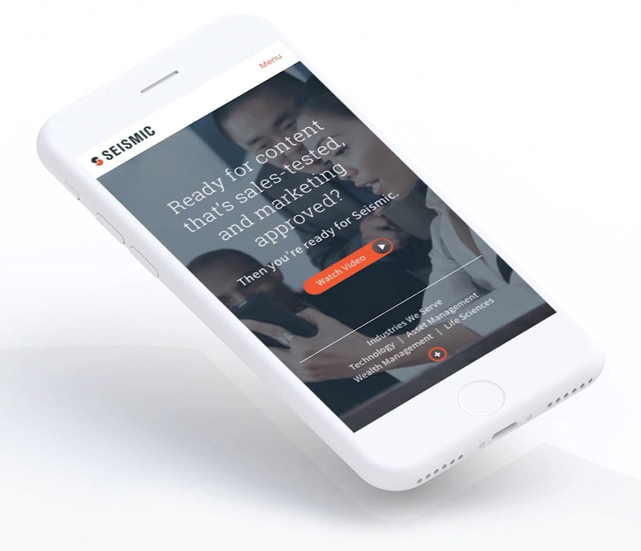
Seismic asked us to refresh their brand and site in a way that would better reflect their cutting-edge product. They had an amazing product, but hadn’t successfully articulated their value proposition. And with more than 600 pages of content that needed to be delivered on a tight timeline, the challenges were complex. So the solutions had to be simple.
Idea
With sales enablement being a relatively new concept, the site needed to pull double duty: educate and convert. Along with a more approachable brand voice and a modern visual language, we ultimately developed new UX/UI for the site, custom photography, and an efficient, optimized and sparkling new code base with a CMS built from scratch.
Brand Identity
We crafted their value proposition, visual approach, and a fresher tone of voice to ensure their brand stood out from competitors.

Simplified type system
We streamlined their type library all the way down to two, each with only a few font variations, to help reduce the overall weight of their site, and provide hierarchy that was previously missing.

Expanded colors
With a complex hierarchy of information to communicate, an expanded color palette helped address the many types of content that might be introduced in quick succession.

Custom assets
We introduced graphic elements as devices to anchor ideas, images, and text. We also worked with a custom photographer to create a library of beautiful, one-of-a-kind photos.

Simplified type system
We streamlined their type library all the way down to two, each with only a few font variations, to help reduce the overall weight of their site, and provide hierarchy that was previously missing.

Expanded colors
With a complex hierarchy of information to communicate, an expanded color palette helped address the many types of content that might be introduced in quick succession.

Custom assets
We introduced graphic elements as devices to anchor ideas, images, and text. We also worked with a photographer to create a library of beautiful, one-of-a-kind photos.
Site Design
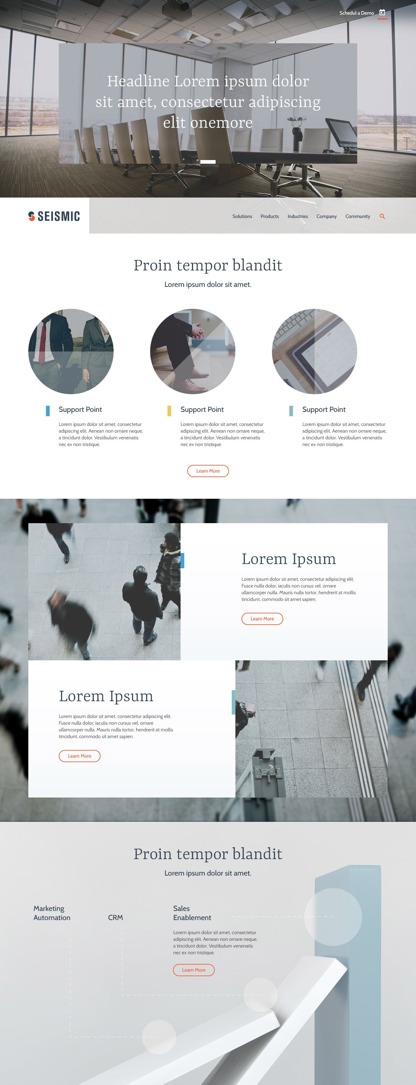
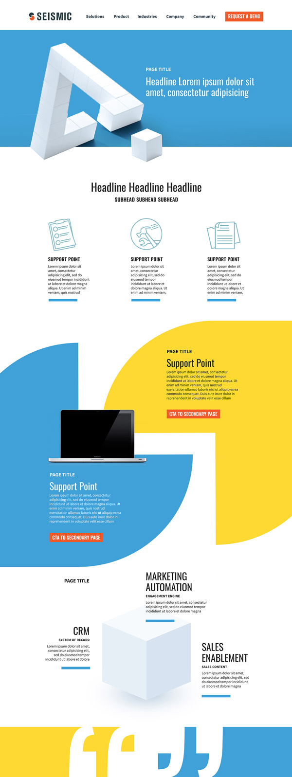
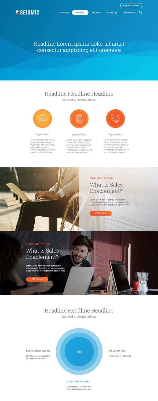
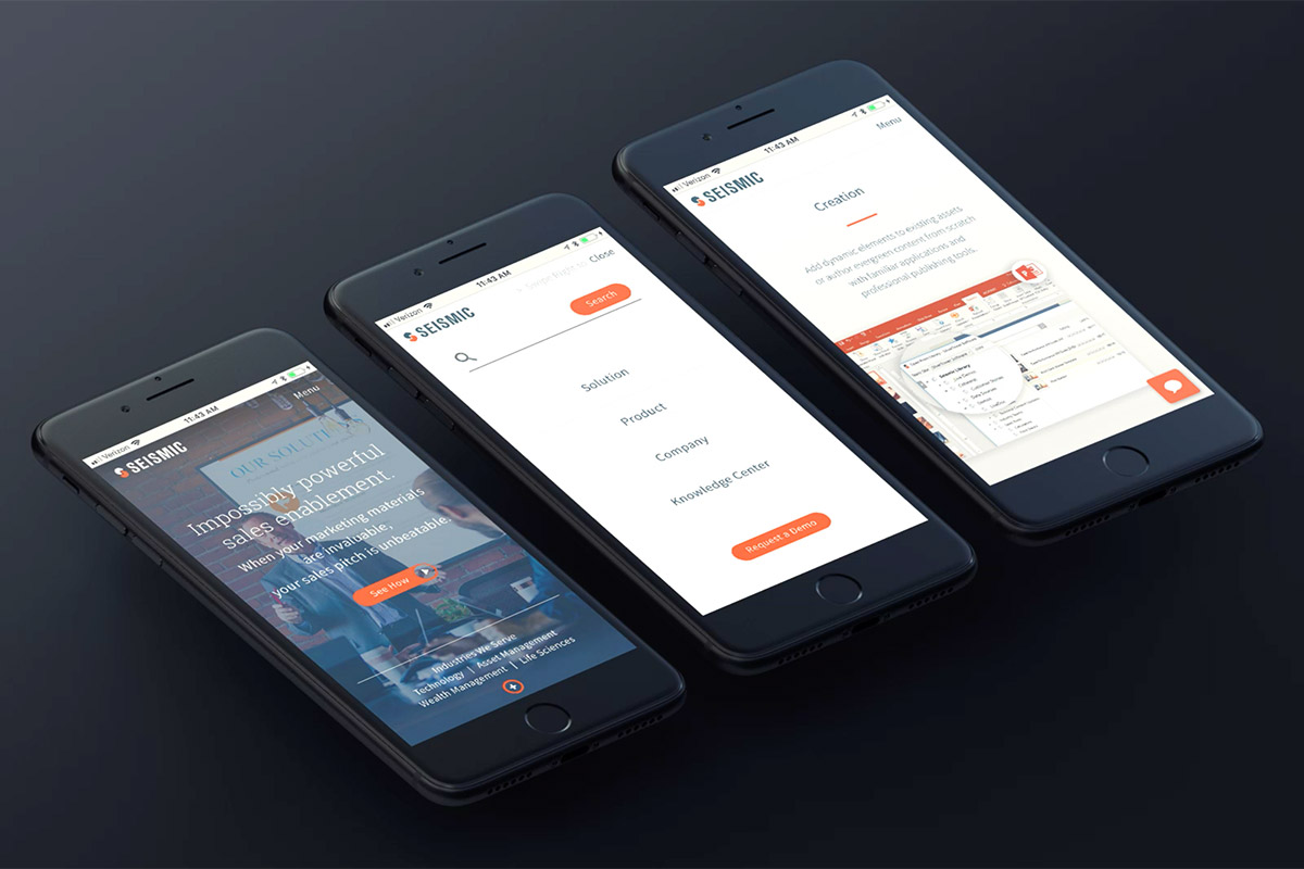
Bright colors and simpler fonts dialed up their marketing, while custom photography explored the human component.
The Final Product
What we developed far surpassed client’s expectations, and enabled us to really push the boundaries of our design within a templated approach to create beautifully designed pages without touching any code. The CMS we built and delivered has front end content control, optimized page load speeds, and an incredibly easy-to-use UI that makes custom updates a breeze.
The site launched to rave reviews and has given Seismic a world-class website to match their product.
